STEP INSIDE
Get your pass to Mahta's Space
Type your name and a way to reach you — a personal visitor card is generated on the spot.
VISITOR
REACH ME — TELEGRAM OR EMAIL
Please fill in both fields.
GENERATE VISITOR PASS →
YOU'RE IN
Mahta's World
VISITOR
{{ visitorInfo.name }}
REACH ME
{{ visitorInfo.contact }}
ISSUED ON
{{ visitorCardIssuedOn }}
NO. {{ visitorCardNumber }}
EXPLORE →
Mahta Mirzaei
PRODUCT DESIGNER · LEVERAGING AI
{{ clockTime }} · {{ clockLabel }}
I Design Products and I Build Them.
Four builds, three case studies, and the parts that went wrong.



4
Made with AI
3
Field Reports
Things I Listen To
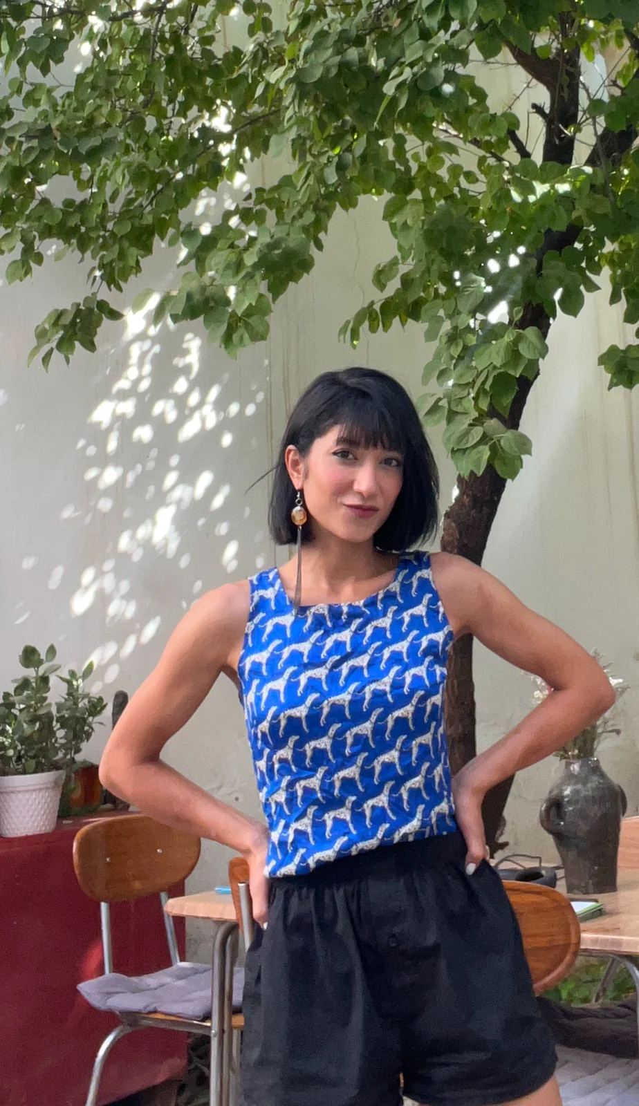
Get to Know Me
{{ visitorInitial }}
💬
Send me a message on Telegram
{{ sendLabel }}
Sent — I'll reply on Telegram soon.
Couldn't send — try again in a moment.
✕
Mahta's World
VISITOR
{{ visitorInfo.name }}
REACH ME
{{ visitorInfo.contact }}
ISSUED ON
{{ visitorCardIssuedOn }}
NO. {{ visitorCardNumber }}
EDIT NAME
EDIT REACH ME
SAVE CHANGES
Made with AI
Field Reports
Things I Listen To
Get to Know Me
✕

AB


{{ p.title }}
{{ p.subtitle }}
{{ p.meta }}
{{ t.song }}
{{ t.artist }}
{{ activeTrackSong }}
{{ activeTrackArtist }}
{{ currentTimeLabel }}
{{ selectedTrackDuration }}
All Tracks · {{ musicTrackCount }}
{{ t.index }}
{{ t.title }}
{{ t.duration }}
My Gallery
Current Obsessions
THE STACK I ACTUALLY USE
Claude Code
Claude Design
Google AI Studio
Firebase
Bolt
Framer
Figma
Codex
Vercel
WHO I AM
Designer first. Then I got curious about making things real.
I started in product design, then went looking for the edge — testing new AI tools the week they launched, until I wanted to build the real thing myself, not just the screen for it.
SKILL RADAR
Where my time actually goes right now — hover a point for the story behind it.
{{ radarTooltip }}
Still leveling up: deep backend/systems architecture — reasoning about it without leaning on the model.




{{ r.title }}
{{ r.subtitle }}
{{ r.period }}
My Gallery — a visual log
Current Obsessions
✕
NATURE & TREKKING
When I'm not working from my Mac, I'm out here — enjoying life in places like these.
HIGHLINE
Extreme sport changed my life by teaching me about balance — it's all about balance, sometimes.
HUB — WORK & STAY SPACE
I have a work-and-stay space in Shiraz, Iran called Hub. Remote freelancers come stay here — we run projects together, host private events, and more.
Company Brain
EXPLORING
Inspired by Tom Blomfield
AI agents are ready — but a company's real know-how is scattered across heads, inboxes, and Slack threads. Building the missing primitive: a "brain" that captures and structures that knowledge so agents can actually run on it.
{{ companyBrainNoteLabel }}
Thanks — sent!
Couldn't send — try again.
Software for Agents
SKETCHING
Inspired by Aaron Epstein
The next trillion users are agents, not people — and they're stuck using interfaces built for clicking buttons. Rethinking software as machine-readable first: APIs and CLIs over forms, with documentation an agent can act on without a human in the loop.
{{ softwareAgentsNoteLabel }}
Thanks — sent!
Couldn't send — try again.
Dynamic Software Interfaces
GATHERING RESOURCES
Inspired by Ankit Gupta
Software still looks the same for everyone, while coding agents are now good enough to let users become their own forward-deployed engineer. Exploring shared primitives that let wildly different interfaces — a task-list email, a calendar-first inbox — ship from the same underlying system.
{{ dynamicInterfacesNoteLabel }}
Thanks — sent!
Couldn't send — try again.
← Back
←
PREV
{{ prevProjectTitle }}
NEXT
{{ nextProjectTitle }}
→
BAROLINE · FLEET MANAGEMENT / LONG-HAUL LOGISTICS · IRAN
He tried it for three days. He was right to stop.
View live project ↗
ROLE
Product Designer
TIMELINE
Sep 2022 – Mar 2023
DOMAIN
Fleet Management, Iran
SHIPPED
Core flow: 3 screens
The first version of Baroline had already shipped. Drivers used it for a few weeks, then stopped. Went back to phone calls.
Inheriting a failed product is different from starting from scratch — the constraint isn't technical, it's trust. Trust, once broken, doesn't come back because the screens got cleaner.
That was the actual brief.
01 ONE LINE, ONE DRIVER
Mohammad drove long-haul for seven years. He tried the old app for three days.
Highway. Night. Job update comes in. Pull over. App loads on bad signal. Three menus. Confirm a status. Screen times out. Signal drops. Nothing saves. Your operator calls because the system shows nothing.
"I'm not crashing my truck for this."
Not drama. A rational decision by someone whose life depends on keeping his eyes on the road. The software was asking him to choose between using it and doing his job. He chose his job. The correct call.
02 DRIVER APP (ANDROID) · OPERATOR DASHBOARD (WEB)
The brief was to redesign the driver app. I argued the brief.
First week: full team, every feature from the old system written on cards. One question per card: driver or operator? Sixty cards. Six landed in the driver pile.
Before that sort, I ran the full feature list through an LLM — pulled every function, tagged each as driver-facing or operator-facing, stress-tested my own logic against it. The cards were the physical version of a call I'd already pressure-tested. Faster to argue a brief when you've already checked your reasoning against something that doesn't care about your ego.
Accept job. Start route. Arrive. Call operator. Problem report. Complete delivery. Everything else was operator complexity that had shifted into the driver app. Nobody had forced the question of who was actually paying for it.
DEMO — FEATURE CARDS SORT EXERCISE
PM — "Drivers need metrics—"
ME — "We're designing for people who actively don't want to use our product. Let's make it so simple they barely have to."
PM — "So we're designing an app for people who hate apps?"
ME — "Exactly."
Two weeks to prove it. Stripping the driver app down had a cost: every function I cut didn't vanish. It had to land somewhere. That somewhere was the operator — and the operator dashboard became the real work.
03 GO
Old App
New App
Drop image, video, or GIF
profile screen
OLD — PROFILE
Drop image, video, or GIF
loads screen
OLD — LOADS
Drop image, video, or GIF
dashboard
NEW — DASHBOARD
Drop image, video, or GIF
loads detail
NEW — LOADS
Six functions. One screen per state. One action per moment.
See next delivery. Go. Arrived. Confirm. Need help. Call.
We A/B tested "Start Route" vs "Go." Go won. Drivers said it felt less like work. "I'm not starting a route. I'm just going." Not a copy preference — that's how you want to relate to a tool at 2am on a dark highway.
COMPLEXITY SHIFT
The complexity didn't disappear. It moved.
The operator dashboard was built from how operators already worked. I knew this because I'd watched one pull three spiral notebooks out of a drawer. Color-coded. Driver names, routes, notes like "doesn't work Fridays." Running 15 drivers out of those notebooks while the software ran in parallel.
OPERATOR — "This is just my notebook."
ME — "Yeah. Because your notebook worked."
Drop image, video, or GIF
operator's spiral notebooks
Drop image, video, or GIF
new digital workflow
SYNC & SIGNAL
One pushback I didn't let go: offline mode. Long-haul routes cross dead zones for hours. Developers said full support was too complex. I said: then drivers won't use it. We found the middle — queue locally, sync on return, one banner: "We'll sync when you get signal — nothing's lost."
One driver drove into a dead zone on purpose to try to break it. Everything synced. He called the office laughing.
"We'll sync when you get signal — nothing's lost." — THE BANNER, RE-WRITTEN
04 I WAS WRONG
I designed job reassignment as drag and drop.
Felt obvious. In testing, two out of three operators moved jobs to the wrong day — a truck arriving at a factory that wasn't expecting it.
I rebuilt it: select the job, choose the driver, confirm with a plain summary. More steps. Zero mistakes in the next round. Intuitive and safe are not the same thing. In a logistics system, safe wins every time.
Drop image, video, or GIF
desktop dashboard: job reassignment flow
JOB REASSIGNMENT — OPERATOR DASHBOARD
05 WHAT CHANGED
15 → 6
FEATURE PURGE · FIVE MONTHS
Ruthlessly cut more than half the features from the driver side. By stopping the operator complexity that had drifted into the mobile app, drivers went from visible frustration to completing the entire core flow on the first try.
COMPLEXITY MOVED · DRIVER'S POCKET → OPERATOR'S DESK
The complexity moved from the driver's pocket to where it belonged — a screen on a desk with enough space to handle it.
06 HOW IT ENDED
The driver flow worked. Cut from 15 functions to 6, drivers completed the core flow first try — the thing the old app never got. Then I left before full launch. The product failed anyway. Not the design. The product. These are different things. Products are systems — business decisions, funding, timing, internal politics, things a designer never fully sees. Good design is one variable. Not the only one.
What I carry: complexity never disappears. You decide who carries it. Never let it be the person doing their actual job.
Drop image, video, or GIF
driver + truck, final shot
GALLERY
Drop image, video, or GIF
designed screen
BAROLINE · FLEET MANAGEMENT · LONG-HAUL LOGISTICS · IRAN · DRIVER APP (ANDROID) + OPERATOR DASHBOARD (WEB) · SEP 2022 – MAR 2023
MIDSHIFT — 2024 · DESIGN · ANALYSIS · STRATEGY
Someone needed to say no to good ideas. So I showed up.
View live project ↗
ROLE
Lead Product Designer
TIMELINE
Jan – Mar 2024
SKILLS
AI Prototyping · Gamification
RESULT
40% lift in signup completion
Midshift was a UK career platform turning blog traffic into file downloads—roadmaps, guides, static PDFs. People arrived, downloaded a document, and vanished forever. I joined as the first design lead to turn it from a content repository into an actual product. Remote. No formal onboarding. Already behind schedule.
The Week I Wasted
I had Clarity dashboards, user surveys, a PRD growing longer by the day, and a team waiting on me for direction.
I didn't have the answer.
Drop image, video, or GIF
Clarity dashboard / desktop screenshot
Drop image, video, or GIF
funnel / drop-off screenshot
That's when I stopped researching and started deciding.
The Argument I Had with Myself
Before taking my proposal to the team, I ran my logic through Claude and Grok—not for validation, but for attack.
I laid out the drop-off metrics, my proposed pivot, and asked both models to tear my direction apart. I wanted to expose every weak spot before speaking up in a room full of people who had been working on this far longer than I had.
Saying "stop building this" in week three, as the person brought in to lead, felt like admitting I was lost. I said it anyway.
Pivot :
The funnel was broken at the start. We required a full CV upload (Step 1) and immediately hit users with a massive, overwhelming wall of skills and static roadmap pages (Step 2). We were showing them the entire mountain before they'd even decided to climb it. Meanwhile, our team was busy polishing Step 10—a complex mentor-matching engine with custom scoring logic and compatibility filters.
Drop image, video, or GIF
old, static roadmap page
We didn't kill the mentor matching—we shifted the workflow backend to Microsoft Azure and stopped hand-crafting every detail in Figma. That single call freed up the team to focus on what actually mattered: getting users past Step 2.
Drop image, video, or GIF
Azure workspace / infrastructure screenshot
The Friction Gamble: Fighting for Context
Shifting the backend to Azure solved the tech constraints, but the real fight was over the funnel interface. The team wanted maximum speed—fewer inputs, frictionless signups.
I pushed back.
Our data proved users weren't lacking resources; they were drowning in them. They didn't need another fast, generic output—they needed to feel understood.
I fought for intentional friction. I believed that if we asked the right contextual questions and got the user to invest a few moments of effort, our AI could deliver something truly life-changing.
I fought for intentional friction. I believed that if we asked the right contextual questions and got the user to invest a few moments of effort, our AI could deliver something truly life-changing.
Drop image, video, or GIF
user survey — friction research
Drop image, video, or GIF
old funnel landing page
We pivoted to an intake flow that mapped intent instead of just parsing a resume. It was no longer about speed to completion; it was about building enough trust to transform a pile of raw skills into a curated, interactive career roadmap.
Build First. Align Later.
Figma was slowing our iteration cycle down. Not because of the software, but because of the review loop. In a small team, we still couldn't communicate interaction feel without three rounds of "Wait, how does this actually work in practice?"
I had been following bolt.new, an AI coding tool that lets you prompt full-stack interfaces into existence. I proposed building directly in code first to see what broke, using Figma later only to align with engineering once the mechanics were proven.
I introduced it casually, but I needed it to work. It did. We had a functional interface in hours. The team moved from reviewing static frames to testing live interactions—we stopped describing ideas and started living in them.
Drop image, video, or GIF
Midshift landing page build
Proving Value Before the Ask
Because our intentional friction gathered deeper context, the AI could finally do real work. Instead of crushing users under a skill-dense PDF, we decided to show them where they actually stood in the global market.
We integrated live market data APIs to cross-reference their extracted skills against real-time demands across the US, Canada, and the UK. The interface immediately surfaced their competency level, salary benchmarks, and market fit—proving the concrete value of our analysis before asking them to create an account.
This value-first moment built the necessary trust. By the time the interface guided them to sign up for full AI-powered career coaching, it didn't feel like a barrier; it felt like the logical next step for their career.
Drop image, video, or GIF
competency / market fit surface
Drop image, video, or GIF
salary benchmark view
Drop image, video, or GIF
sign-up moment, full view
Trust Is in the Details
None of this was a stroke of genius—it was dozens of small corrections driven by tight feedback loops. It was messy, fast, and demanding.
I learned something critical about AI products: user trust doesn't come from an LLM being "smart" or impressive. It comes from highly curated outputs that mapped directly to an individual's skills.
By delivering clear, immediate actions instead of vague career advice, we didn't just ship a smart tool—we built a product that respected the user's time and their career pivot.
FIELD REPORT // BETTERMODE (FORMERLY TRIBE)
Bettermode: Scaling No-Code Community Architecture at High Velocity
View live project ↗
ROLE
Product & Systems Designer (Independent Agreement / Core Team of 4)
PLATFORM
No-Code Community Engine (Enterprise Clients: Lenovo, Mercedes-Benz)
STACK & METHODS
Bettermode Modular System, Claude Artifacts, LLM Research Agents, Figma Systems Documentation
OUTPUT
2 High-Fidelity Multi-Tenant Templates / Week (End-to-End Autonomy)
Drop image, video, or GIF
Live Bettermode canvas — full multi-tenant desktop layout
Drop image or GIF
mobile mockup
01 ZERO MICROMANAGEMENT, TOTAL OWNERSHIP
Bettermode is a Canadian no-code platform powering community hubs for global enterprise brands. I worked as one of four expert designers operating with total professional autonomy. There were no project managers breathing down our necks or daily check-ins. We were expected to lead our own process, manage time, and take end-to-end responsibility for shipping production-ready community spaces.
To keep up with enterprise expansion, we needed to prove that the platform's modular block engine could adapt to drastically different mental models—from high-density Web3 platforms to dark-mode entertainment hubs and structured ed-tech dashboards.
Drop image, video, or GIF
Admin working panel — real-time modular block customization
03 RAPID PROTOTYPING VIA CLAUDE ARTIFACTS
To test interaction feel before building inside the production environment, I leveraged Claude Artifacts. I built lightweight, interactive micro-prototypes to stress-test layout responsiveness, component hierarchies, and UX state transitions.
This lean sandboxing phase eliminated guesswork, allowing me to ship polished, functional layouts into the platform with zero wasted visual iterations.
CLAUDE ARTIFACTS PROTOTYPE
Drop image, video, or GIF
Final rendered template — live in Bettermode
FINAL BETTERMODE TEMPLATE
04 HIGH-VELOCITY EXECUTION: 2 TEMPLATES / WEEK
2×
By pairing Bettermode's modular design system with my AI research pipeline, I scaled output to two complete, industry-specific templates per week.
Each release required full visual branding, responsive desktop/tablet/mobile breakpoints, and an exhaustive Figma design system handoff. Because copy-pasting didn't exist between environments, every single component, token, and state was meticulously recreated and documented in Figma as an official record for enterprise clients.
DESKTOP
TABLET
MOBILE
05 THE TAKEAWAY: SYSTEMS OVER PROCESS
My time at Bettermode proved that high velocity doesn't mean cutting corners—it means building personal leverage. By taking full ownership, embracing AI tools as research partners, and respecting system constraints, I delivered enterprise-grade work at startup speed without needing to be managed.
TEMPLATE GALLERY
Drop image, video, or GIF
{{ g.label }} — template cover
{{ g.label }}
FIELD REPORT — BETTERMODENO-CODE COMMUNITY ENGINE
TEARDOWN · PRODUCT INTELLIGENCE ENGINE
Turning design audits into business ROI.
Teardown isn't just an analyzer; it's a personalized audit tool that trains itself on your specific business goals. Built builder-first — a sophisticated AI stack that moved this from idea to functional web app at record speed.
View live project ↗
{{ teardownAudioIcon }}
Voice note — why I built this
Drop a video, GIF, or image
Cinematic hero — Teardown product demo (or click to browse)
Drop image, video, or GIF
Generic vs. Teardown critique comparison
THE "AHA!"
Escaping the generic audit trap.
We've all seen generic AI design critiques — upload a screenshot, and it tells you the contrast is low. It's predictable and doesn't help you ship a better product. Most startups are flying blind on the actual business impact of their UX. I built Teardown because designers don't need another checklist — they need a high-leverage action plan that moves the needle on revenue.
ORCHESTRATING THE WORKFLOW
From idea to deployable app, one AI stack at a time.
1
Ideation & Prototyping
Used Claude to stress-test the logic and ideate the core modules, then designed the entire UI system — components, assets, screen flows — for a modern, sleek, professional-grade feel.
2
Engineering the Brain
Leveraged Google AI Studio's Pro APIs to architect a "brain" that doesn't just see images — it understands business logic and technical constraints.
3
Deployment Ready
By syncing design files with the functional brain in AI Studio, a messy design process became a fully functional, ready-to-deploy web application.
A PRODUCT INTELLIGENCE ENGINE
Discovery-first, not checklist-first.
To transform raw audits into actionable intelligence, I developed a system that contextualizes design decisions through the lens of user intent. This engine serves as the backbone for the diagrams and data-driven insights detailed below, ensuring that every UI recommendation is backed by structural logic and business impact.
Drop a video or GIF
Deep context scanning & annotation system in action (or click to browse)
Annotation list
9:16 — DROP A SHOT
Annotation List
Friction points prioritized on a Red / Yellow / Blue effort-vs-impact scale.
Action plan
9:16 — DROP A SHOT
Action Plan
Every card expands into a brief with checkboxes for designers and tags for devs.
Live calculator
9:16 — DROP A SHOT
Live Calculator
Enter your data — see the money you're leaving on the table.
CLOSING
Teardown proves UX is only as good as the business impact it delivers. By automating the audit and tying it directly to ROI, teams stop guessing and start fixing what matters — simple, human, and built to turn design into a measurable business asset.
AIS
CL
BUILT WITH GEMINI + CLAUDE
UIKit: decoding brand DNA in a single click.
We've all been there — joining a new team or starting a redesign only to spend the first week on a scavenger hunt through Figma, Google Drive, and old Slack threads just to find the right logo or hex code. It's a massive time sink. UIKit solves this by using AI to instantly extract every component, token, shadow, and brand style with a single click. Whether you're pointing it at a live URL or feeding it a pile of messy assets, it automatically generates a full, documented UI kit that's ready to hand off as your team's single source of truth. No more chasing original source files; just drop, extract, and start building.
View live project ↗
{{ uikitAudioIcon }}
Voice note — how the brand-DNA idea started
Drop image, video, or GIF
Cinematic visual — UIKit extraction in action (video/GIF supported)
Drop image, video, or GIF
extracted tokens close-up
AUTOMATED BRAND INTELLIGENCE
I didn't just want this to scrape data; I wanted it to actually think like a designer.
I built the brain of UIKit by training the AI using Gemini and Claude to deeply identify a brand's DNA. It doesn't just show you colors; it exports full design tokens in JSON format so your developers can implement them instantly. If your source material is missing a button or a specific component, the AI understands the existing logic and generates the missing pieces on the fly. Plus, it handles the vocal language — extracting brand do's and don'ts to deliver high-quality copy for headers and CTAs that actually sounds like the business.
Drop image, video, or GIF
working app extracting a brand
Drop image, video, or GIF
the finished kit output (tokens, JSON)
BRIDGING THE GAP BETWEEN DESIGN AND VISUAL COMMUNICATION
Design and marketing finally speak the same language.
I built an AI sandbox that bridges the gap, using your extracted brand DNA to act as a personality guardian. It's a content powerhouse that lets you generate on-brand copy for any surface.
Drop image, video, or GIF
dynamic copy generation component
Dynamic Copy Generation
Instantly create headlines, slogans, CTAs, and body text tailored to your specific brand voice.
Drop image, video, or GIF
tone alignment component
Tone Alignment
Switch between writing styles while staying locked into your business's unique personality.
Handoff-Ready Workflows
Generate high-quality, high-conversion copy that's ready for the marketing team to use immediately.
Drop image, video, or GIF
handoff-ready workflow component
MY STACK & AI WORKFLOW
I started by sketching a futuristic design in Cloud Design and then used roadmap.sh to learn the technical side. The real struggle was in Google AI Studio, where I spent a day training Gemini and Claude to look at screenshots and actually understand a brand's DNA — everything from colors to the way they write. Then used Cloud Code to pull it all together. It was a challenging learning curve, but it turned a messy process into something simple enough for anyone to use.
METAPROMPT · AI PROMPT-ENGINEERING LOGIC ENGINE
MetaPrompt: From Messy Ideas to Aesthetic Realness.
Let's be real — prompt engineering is a whole chore. Most of us just want a fire visual without acting like a coding wizard. That's why I built MetaPrompt.
View live project ↗
{{ metapromptAudioIcon }}
Voice note — why I built this
THE STARTING POINT
Not your average prompt generator — it's a logic engine.
MetaPrompt isn't your average prompt generator — it's a logic engine. It uses Deconstruction and a Brief Graph to map out your ideas so they actually make sense. Think of it as Proactive Co-creation: it stops you from getting generic, mid results by helping you engineer the prompt like a pro. You're not just typing; you're building with a co-pilot for generation that actually hits.
Once you're in the dashboard, no blank canvas anxiety here. You've got a Pre-made Prompt ready to go — use it as a base or start fresh. The chatbot lets you toggle between generating an Image or a Story, and you can dial in your Ratio and Resolution right there to get the technicals out of the way before the deep dive.
Drop image, video, or GIF
intro — hitting "Start Creating"
Drop image, video, or GIF
dashboard — pre-made prompt, Image/Story toggle, ratio & resolution
THE ENGINEERING NIGHTMARE & THE ITERATIVE LOOP
Building this wasn't just about UI.
It was a total technical logic puzzle. I spent days trying to "set the brain" of the LLM to actually deconstruct human thought rather than just spit out generic answers.
My process wasn't a straight line — it went through a constant, circular dance between multiple AI brains. I used Google AI Studio as the primary lab for the "brain" — testing functions and seeing if the MVP could actually handle the logic I was throwing at it. For the visual side, Claude was my go-to for designing components and assets, while Gemini and ChatGPT acted as my constant critics and brainstorming partners. I'd jump between these tabs in a loop: engineering the logic in one, testing the design in another, and then going back to refine and iterate. It was messy, but that's how I managed to turn technical chaos into something that actually works.
THE REFINEMENT FLOW
Clarifications keep you in the loop, then the prompt updates in real time.
Three steps, one loop: write, clarify, confirm — and the prompt updates automatically after each.
1
2
3
Drop image, video, or GIF
prompt writing/editing box
STEP 1 · WRITE
Start with a draft, not a blank page.
Use the Pre-made Prompt as a base or write fresh in the editing box — no blank canvas anxiety.
STEP 2 · CLARIFY
Hit "Refine the Prompt."
Clarification Questions get specific — textures, lighting, vibes — so the AI enhances your prompt instead of guessing.
Drop image, video, or GIF
clarification questions
Drop image, video, or GIF
confirmation modal — prompt confirmed
STEP 3 · CONFIRM
You stay in the loop.
A confirmation modal keeps the human in charge — once you confirm, the prompt and the Brief Graph update in real time.
THE BRIEF GRAPH
The logic map behind every prompt.
This is the logic map. It shows how every individual, object, and environment detail is linked. Some nodes are solid, some need more energy. You can click any card, edit the info — like atmosphere or settings — directly, and the whole prompt adapts in real time.
Drop a video or GIF
Brief Graph — clicking nodes, live prompt update
IMAGE ATTRIBUTIONS
Your aesthetic toolkit.
Then we've got the Image Attributions tab. Think of this as your aesthetic toolkit. Use the dropdowns to dial in the location, style, or time of day. It's for those hyper-specific details that make the AI's job easier and your result way more high-end.
Drop image, video, or GIF
Image Attributions — location, style, time-of-day dropdowns
FINAL GENERATION
No more mid results — just 100% custom, high-quality visuals.
Once the graph is looking right and the vibes are confirmed, hit Generate. The AI builds out the full imagery and story thread. Done.
Drop image, video, or GIF
final generated image
Drop image, video, or GIF
generated story thread
GENERATED GALLERY
A few of the results, straight from the graph.
RAW PROMPT
Drop image
the original, unrefined prompt
FINAL PROMPT
Drop image
the refined prompt that generated the gallery below
Drop image
AIBOS · AI OPERATING SYSTEM
Confessions of a 'Vibecoder': Why I Built AIOS.
I've spent years mastering the 'vibe coding.' As a designer, my world was UI, front-end aesthetics, and creating experiences that looked perfect. But every time I tried to turn those visuals into a living, breathing web app, I hit the same wall. I could paint the car, but I had no idea how to build the engine.
I realized I was caught in a massive skill gap. I had the vision, but backend logic, database architecture, and full-stack deployment felt like a black box.
View live project ↗
{{ aibosAudioIcon }}
Voice note — the vibecoder confession, in my own words
MY VERY FIRST PROMPTS — USING AI AND EXPLORING TOOLS
PROMPT — DRAFT 01
"Hey, can you help me build a really cool looking task manager app? I want it to have a dark mode, some glassmorphism effects, and look very minimalist like Apple's designs. Just make it look professional and 'pro' level."
Drop image, video, or GIF
chat interface — task manager prompt
PROMPT — DRAFT 02
"I have an idea for a social media app for plant lovers. Can you code the front page for me? It should have a feed with cards for pictures, a nice sidebar, and use a soft green color palette. I want it to feel very organic and modern."
Drop image, video, or GIF
chat interface — plant social app prompt
GETTING LOST IN THE SEA OF 'HOW-TO'
I found myself drowning in a sea of resources. There are endless AI tools, roadmaps, and tutorials, but they all felt incredibly generic. They didn't know my specific stack, they didn't care about my current skill level, and they certainly didn't provide a real-time GPS for the specific problems I was facing. I didn't need more 'what to build' prompts; I needed to understand how engineers actually think.
Drop image, video, or GIF
generic roadmap.sh style roadmap
Drop image, video, or GIF
generic course catalog
So, I built AIBOS (AI Operating System) — not just as a tool, but as a content-aware architecture that manages the mental models and workflows I was missing.
AIBOS: NOT A GENERAL ASSISTANT
Unlike generic AI tools that start by assuming your needs or drowning you in code snippets, AIBOS begins by understanding who you are and how you think.
It doesn't just ask what you want to build; it audits your skills, your stack, and your mental model to create a personalized bridge between your design vision and engineering reality.
By setting my skills and stack upfront, I give the AI context, not just instructions. This stops the drift into generic code and ensures the path is built for my level, focusing on progress instead of fixing misalignments.
Drop image, video, or GIF
onboarding screen 1 (working prototype/demo)
Drop image, video, or GIF
onboarding screen 2 (working prototype/demo)
AI acting as a proactive co-creator, will helps you build the project's 'brain' first — creating structured artifacts that keep the AI aligned and prevent hallucinations, ensuring every asset and document stays in perfect sync as you move from idea to execution.
STEP ZERO: SETTING THE GPS
Before diving into the code, AIBOS forces me to stop and orient.
It replaces the anxiety of the blank prompt with a guided 'Step Zero' that establishes the specific level of complexity I'm aiming for.
Drop image, video, or GIF
dashboard + chatbot starting view
Drop image, video, or GIF
highlighted 'next step' card asset
THE ENGINEERING MINDSET
Building the project's 'brain.'
Instead of jumping straight into messy code, AIBOS focuses on building the project's memory first. It transforms the workflow from a linear path into a feedback loop where you're not just 'vibe coding,' but actually thinking like an engineer. By establishing a structured truth through artifacts, you ensure that every response is accurate and every asset is aligned from the start.
Drop image, video, or GIF
Step Zero diagnostic audit UI
01
Diagnostic Orientation
Before a single line is written, AIBOS audits your stack and skills. This 'Step Zero' sets the GPS, ensuring the AI understands the complexity level you're aiming for.
Drop image, video, or GIF
priority.md / stack.md artifact files
02
Artifact-Driven Alignment
You'll create core files like priority.md and stack.md. These serve as the blueprint that keeps the AI on track, effectively eliminating hallucinations by providing a constant point of reference.
Drop image, video, or GIF
structured execution / mentorship flow
03
Structured Execution
With the 'brain' established, the build process becomes a mentorship. You move through prompt writing and coding phases where the AI explains the architectural logic behind its suggestions, helping you understand the structural 'why' while you build.
Drop image, video, or GIF
recording / prototype embed — the project brain in action
LEARNING BY BUILDING: FROM DESIGNER TO ENGINEER
Building AIBOS wasn't just about the final product; it was my personal masterclass in learning how to think like an engineer. I was my own most difficult user and the primary QA, constantly running into the exact friction points I wanted to solve. I experimented with dozens of stacks and tools to keep track of my ideation and design assets, all while obsessing over how to make AI responses feel natural, trainable, and genuinely personalized.
Drop image, video, or GIF
mockup — ideation & design asset workspace
MOCHI · DESKTOP AI COMPANION
Mochi: The Tamagotchi That Does Your Work.
Emotional leverage meets autonomous utility.
Mochi is a response to the quiet loneliness of the remote-work era. It bridges the gap between a passive desktop pet and a high-functioning AI agent. By combining the habit-forming loops of a digital companion (feeding, bathing, dragging) with actual professional leverage, Mochi becomes an ambient partner that knows you, helps you, and keeps you company.
View live project ↗
{{ mochiAudioIcon }}
Voice note — why I built this
Drop video, GIF, or image
demo — Mochi prototype walkthrough
THE LINE BETWEEN DISTRACTION AND DAILY HABIT
Digital pets fade. AI agents hide. Mochi does neither.
Digital pets fade because they lack utility. You feed them, watch them walk around, get bored, and delete the extension. AI agents face the opposite problem: high utility, zero presence. They're buried in bookmarked tabs or sidebars, waiting for you to type a prompt. Mochi bridges that gap by acting as an ambient companion on your screen that builds daily usage habits through virtual care loops (feeding, bathing, energy cycles), while serving as a functional teammate when you need to get things done.
Drop image, video, or GIF
Feeding loop
🍊
Feeding
Tap Feed to top off Mochi's hunger stat — skip too many days and it'll visibly sulk.
Drop image, video, or GIF
Bathing loop
💧
Bathing
Keep hygiene stats up so Mochi stays glossy instead of grumpy — a quick daily ritual.
Drop image, video, or GIF
Sleep / wake cycle
🌙
Sleeping
Mochi naps on idle energy and wakes back up the moment you tap in — no missed check-ins.
PERSONALITY AS AN INTERFACE
Instead of one chat prompt, Mochi switches modes.
Instead of a single chatbot prompt line, Mochi switches between modular behavior modes depending on what you're doing — each one a different working relationship, not just a different skin.

SCOUT MODE
Sends Mochi on a mission.
Research a tab, run competitor analysis, or summarize long documentation while Mochi actively processes in the extension environment.
Drop image, video, or GIF
Scout Mode — research/summarize in action

CREATIVE DIRECTOR MODE
An opinionated design critic.
Audits the current tab from a UX/UI perspective and returns a prioritized fix list — no generic AI copy, just calls.
Drop image, video, or GIF
Creative Director Mode — UX/UI audit & fix list

CALM FRIEND MODE
A companion built for deep focus.
A customizable Pomodoro tool that suppresses distracting apps and mutes notifications while you lock in.
Drop image, video, or GIF
Calm Friend Mode — Pomodoro / focus tool
💡
NOTEYou can even set behavioral traits like Independent, allowing Mochi to auto-feed when you're locked in flow state and forget to interact with it.
PERSONALITY & PROFILE TRAITS
Tailoring Mochi's identity and behavioral DNA.
Personality isn't just a skin — it actively dictates how Mochi interacts with you and manages its own state. Through the profile menu, you can set Mochi's gender identity, which dynamically swaps its pixel color theme: Male (Blue), Female (Pink), or Non-binary (Purple/Rainbow).
Beyond visuals, behavioral traits change how Mochi responds to your routine:
Independent — Makes Mochi completely self-sufficient. It handles its own feeding, bathing, and stat refills so you can stay in flow without managing care loops.
Affectionate — Amplifies happiness stats and triggers extra animations whenever you pet or interact with Mochi.
Honest / Brutal — Removes diplomatic filters, giving Mochi a blunt, direct tone during design critiques and task feedback.
Low Maintenance — Slows down stat degradation over time, perfect for long, uninterrupted deep-work sprints.
Drop image, video, or GIF
Profile menu — gender theme & trait picker
Drop image, video, or GIF
Observer Mode / Private Mode toggle
DESIGNING FOR PARANOID REMOTE WORKERS
Privacy as a toggle, not an afterthought.
Remote workers and developers don't want an AI extension silently scraping their screen when they're working on confidential code or personal files. I built explicit observation toggles directly into Mochi's core logic.
In Observer Mode, Mochi reads tab DOM structure to extract context for auditing and research tasks. Toggling to Private Mode instantly cuts off screen reading and network calls to the LLM, dropping Mochi back into a pure offline pet companion.
Drop image, video, or GIF
Searchable history log timeline
ACTIVITY LOG & HISTORY
Complete transparency for every mission executed.
Because Mochi runs background research, UX audits, and content summaries across multiple browser tabs, having a single source of truth is essential. The History Log gives you a full, searchable record of every action Mochi has taken.
Whether you need to retrieve a competitor research report from three days ago or revisit an audit fix list from a previous tab session, Mochi stores all historical outputs in one accessible timeline — ensuring no insight gets lost when a tab closes.
BYPASSING FIGMA FOR LIVE CODE
WHAT STAYS AFTER THE NOVELTY WEARS OFF
Presence, personality, and clear boundaries — that's what makes people keep it around.
Building Mochi proved to me that AI interfaces don't need to look like another generic ChatGPT wrapper. Giving an agent presence, personality, and clear privacy boundaries makes people actually want to keep it around.